Cappadox Festival — Typographic Poster Design
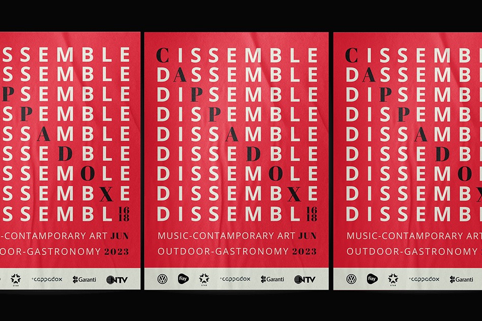
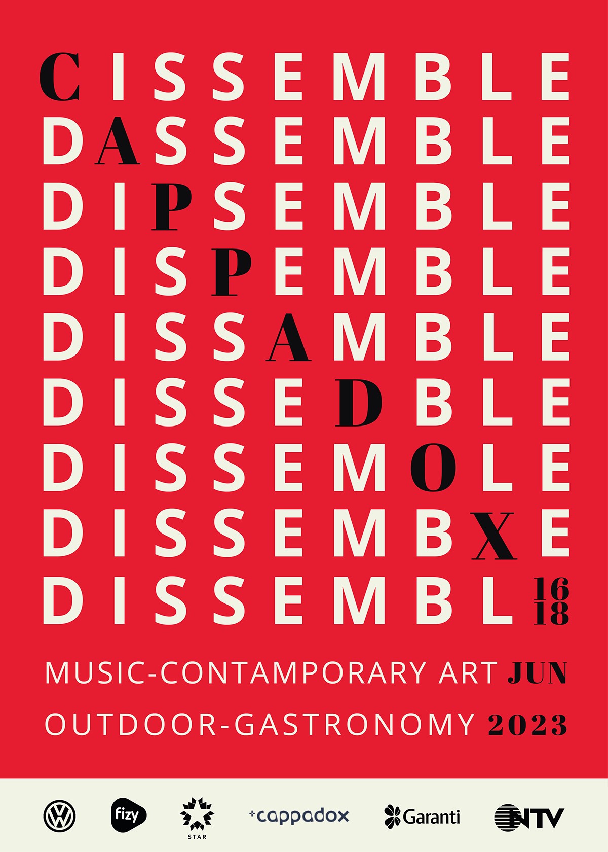
A concept-driven typographic poster designed for Cappadox Festival, built around the idea of dissemble — revealing meaning gradually through fragmentation and ambiguity.
Role
Graphic Designer
Project Type
Typographic Poster & Concept Design
Focus
Conceptual typography · Visual storytelling
Concept Overview
The concept of dissemble was chosen to represent mystery, concealment, and layered meaning. Rather than presenting information directly, the design invites viewers to decode and interpret the visual language—mirroring Cappadox’s exploratory and multidisciplinary nature.
Typography becomes a tool for suggestion rather than clarity, encouraging curiosity and discovery.
Design Approach
The Cappadox letterforms were fragmented and partially concealed, using layered structures to balance visibility and obscurity while revealing meaning gradually.
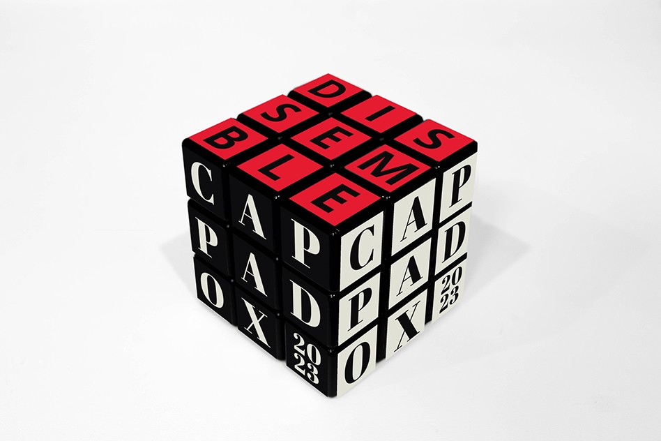
To extend the concept beyond the poster, a Rubik’s cube–inspired object was designed using the disassembled Cappadox letterforms.
Outcomes
Typography communicates through ambiguity.
The festival identity feels exploratory rather than declarative.
